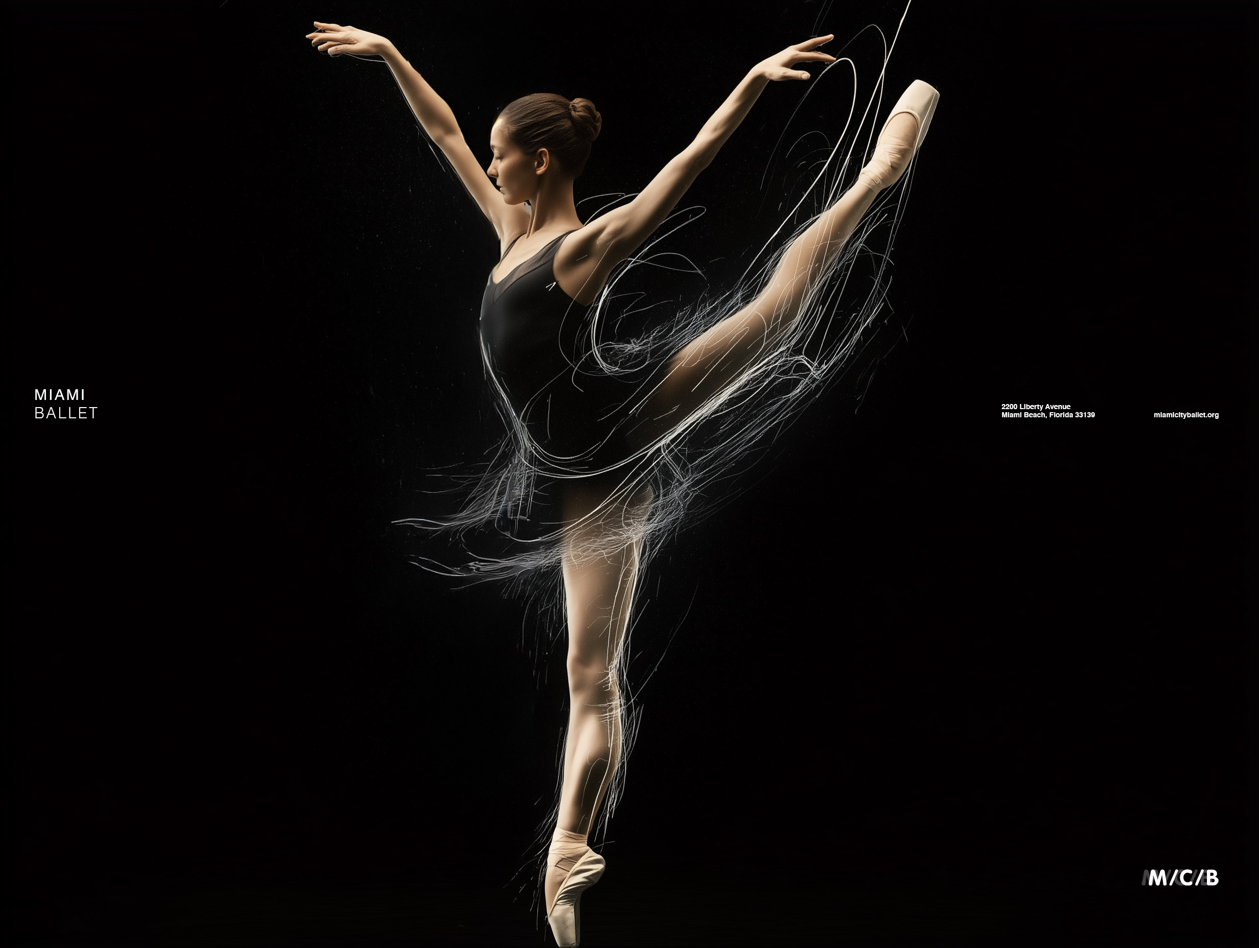
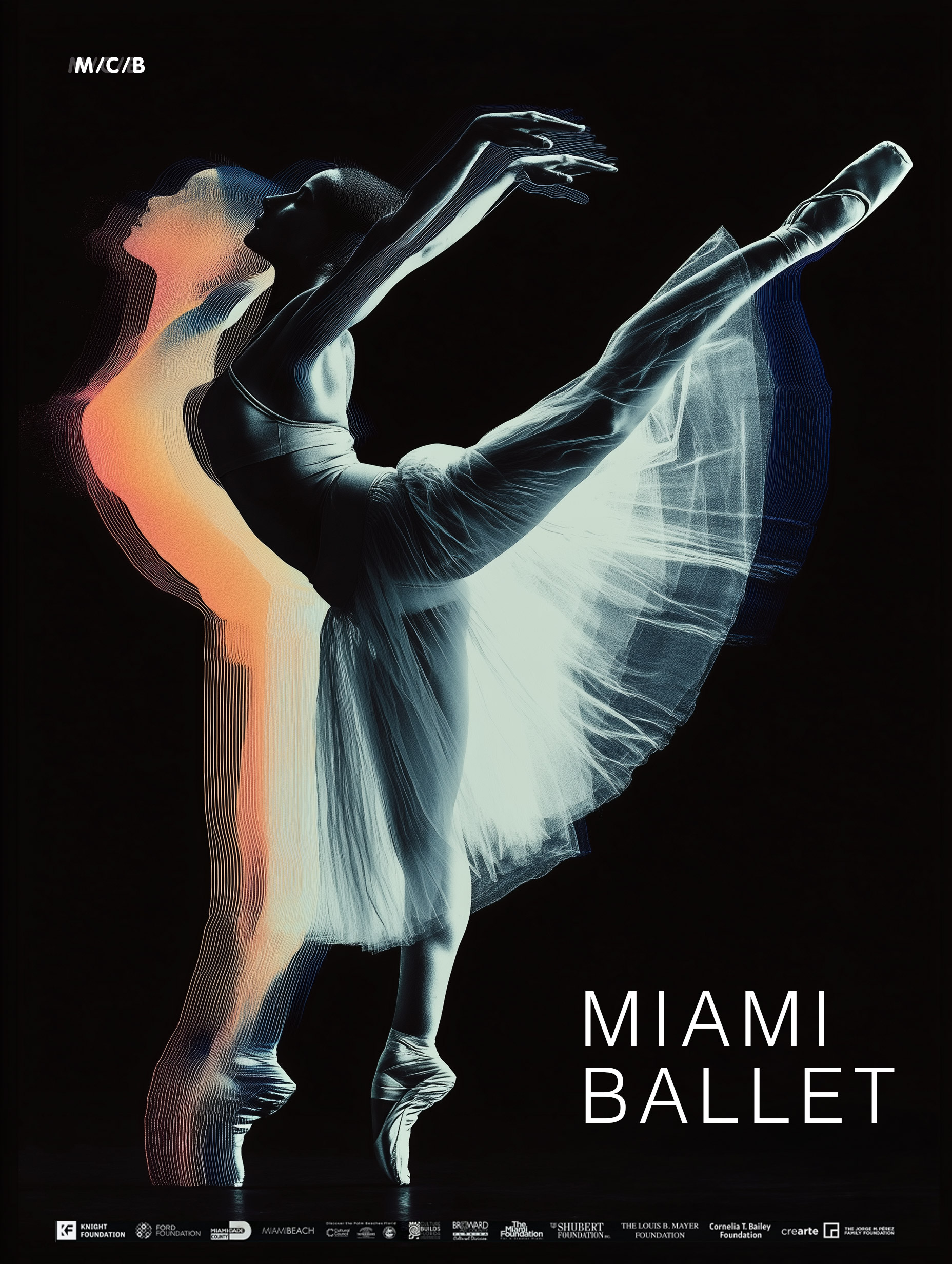
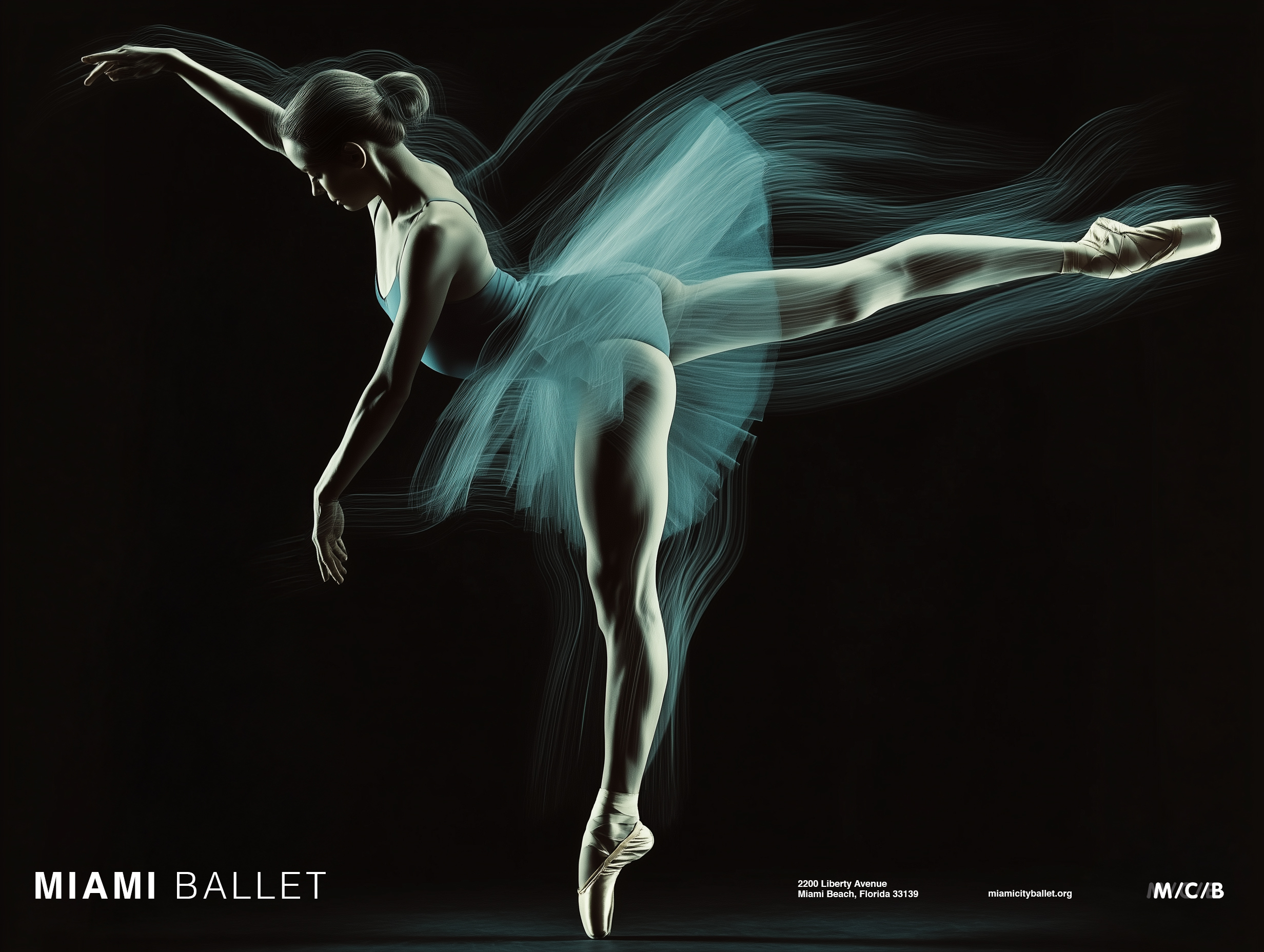
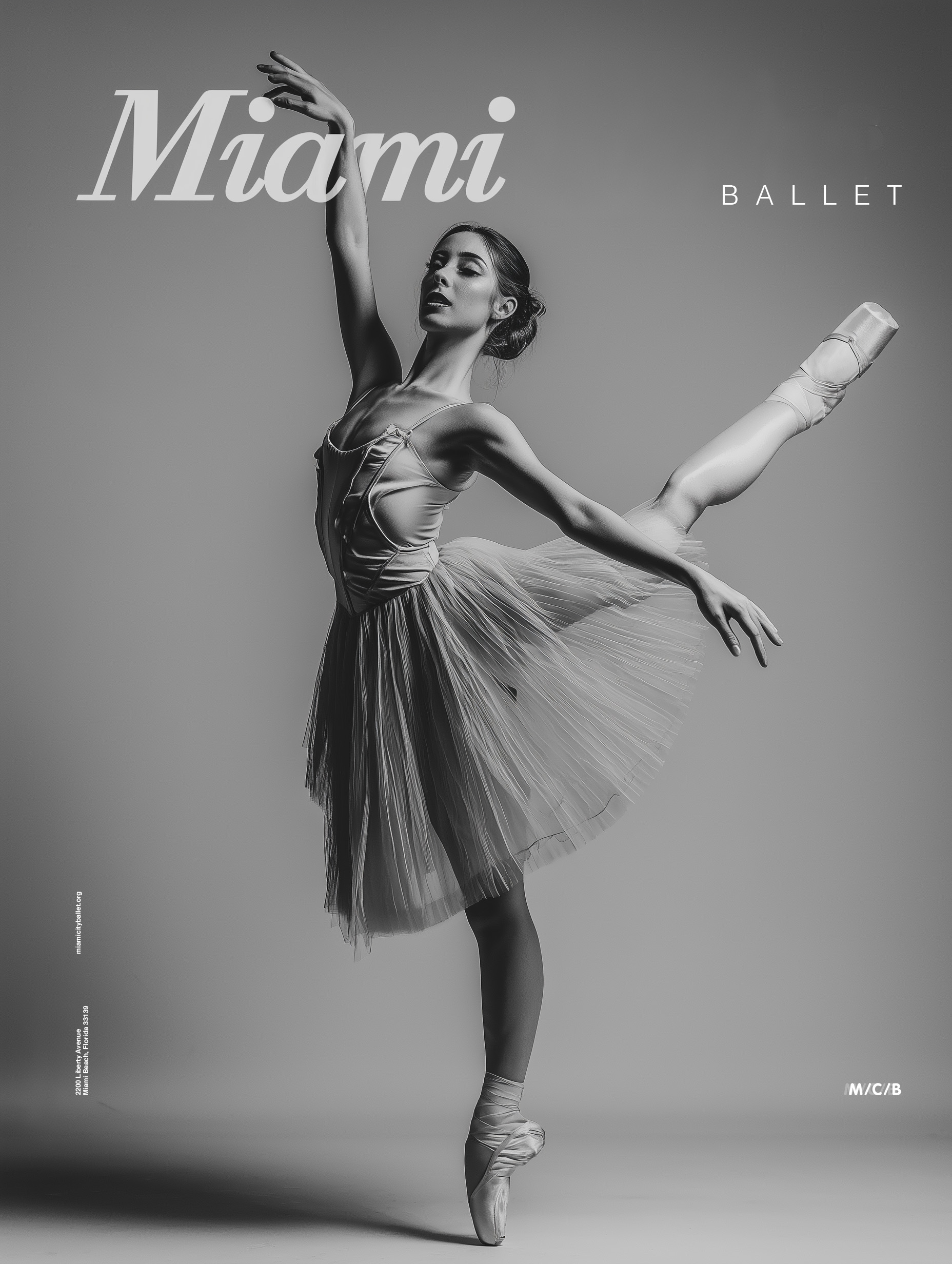
Movement does not stop when the dancer does. It lingers—in the air, in the eye, in the long exposure of a camera that refuses to let the moment close. This is the idea at the center of the Miami Ballet campaign. Not the pose, not the arrival, but the getting there. The trace of a body through space, caught mid-thought, mid-breath, mid-everything.
Miami adds its own layer. The light here is particularly thick, golden, slightly unreal—and it does something to a dancer in motion that no other city quite replicates. The campaign leans into that. The posters are not documentation. They are evidence of something that happened and kept happening after it was supposed to stop.


The Logo Moves
Most logos stand still and ask you to look at them. This one does not have that option. The mark is built from motion—a line that starts as a body and ends as a gesture, confident enough to be read at a glance and interesting enough to reward a second look. Identity as choreography.
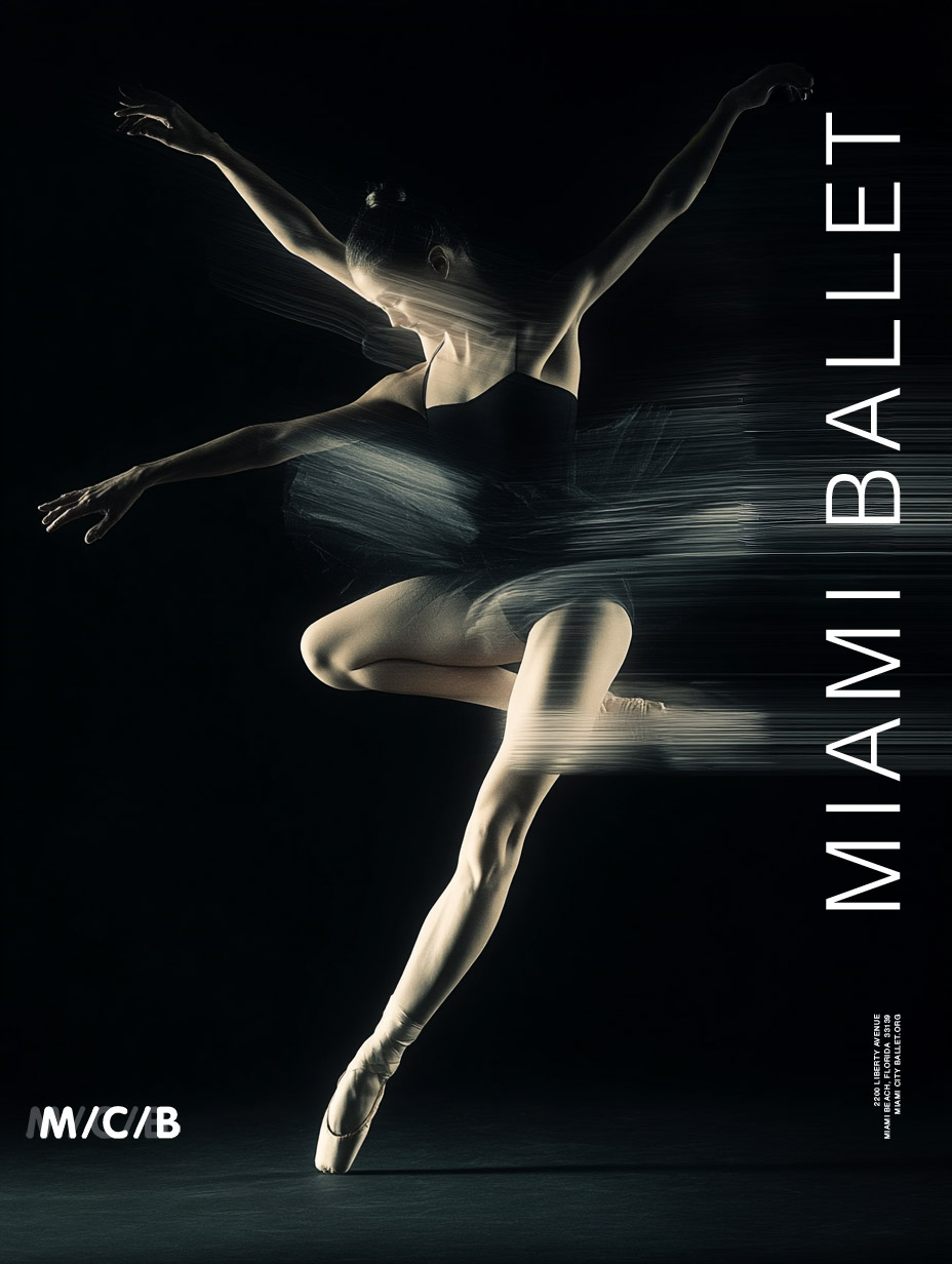
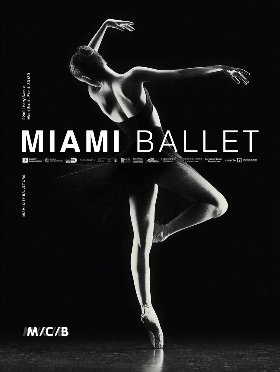
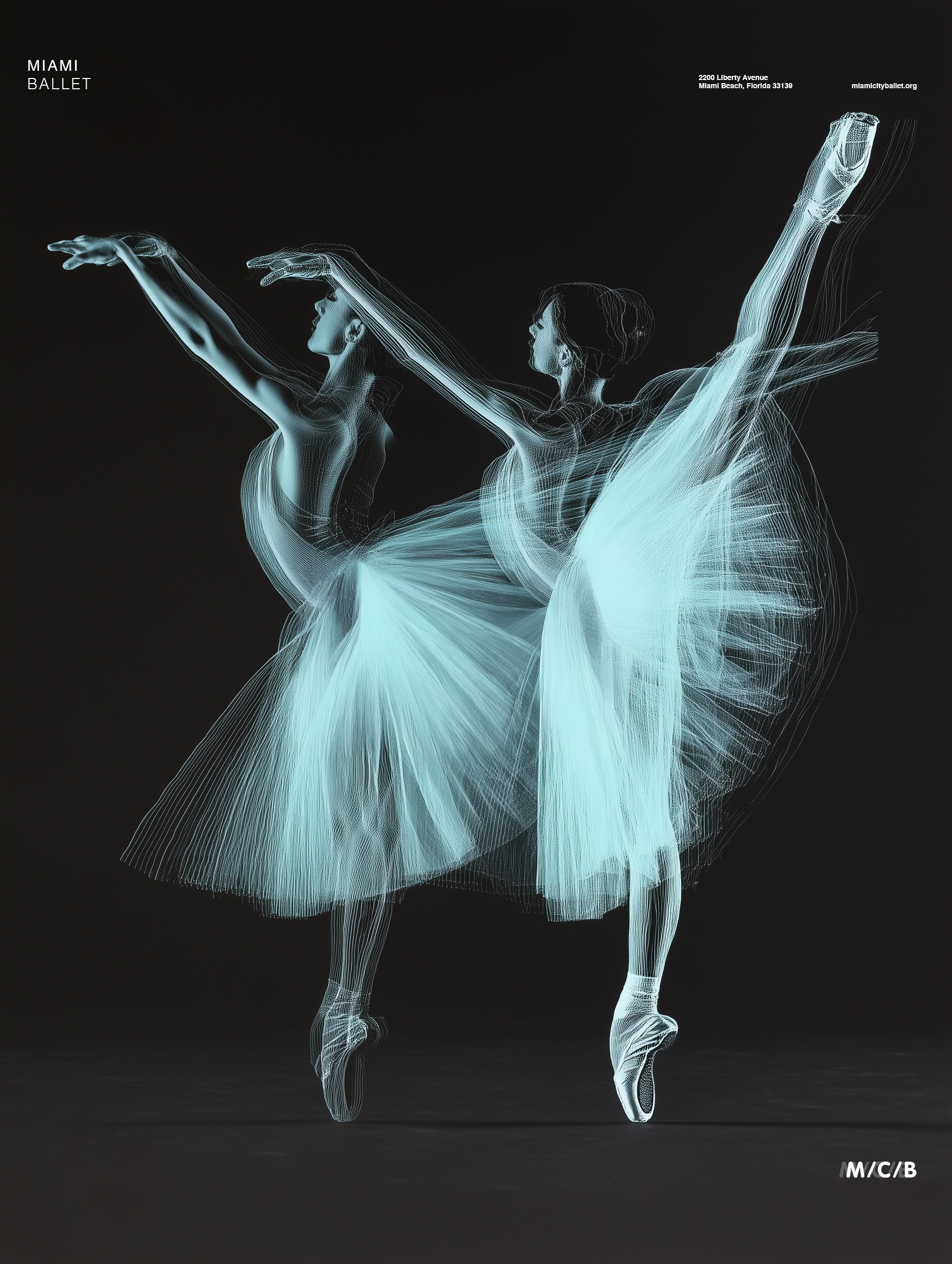
The Poster As Stage
Each poster is its own performance. The motion traces turn the image into something between photography and drawing, between record and interpretation. You are not looking at a dancer. You are looking at what dancing leaves behind—the visual residue of discipline and grace moving faster than the shutter can follow.

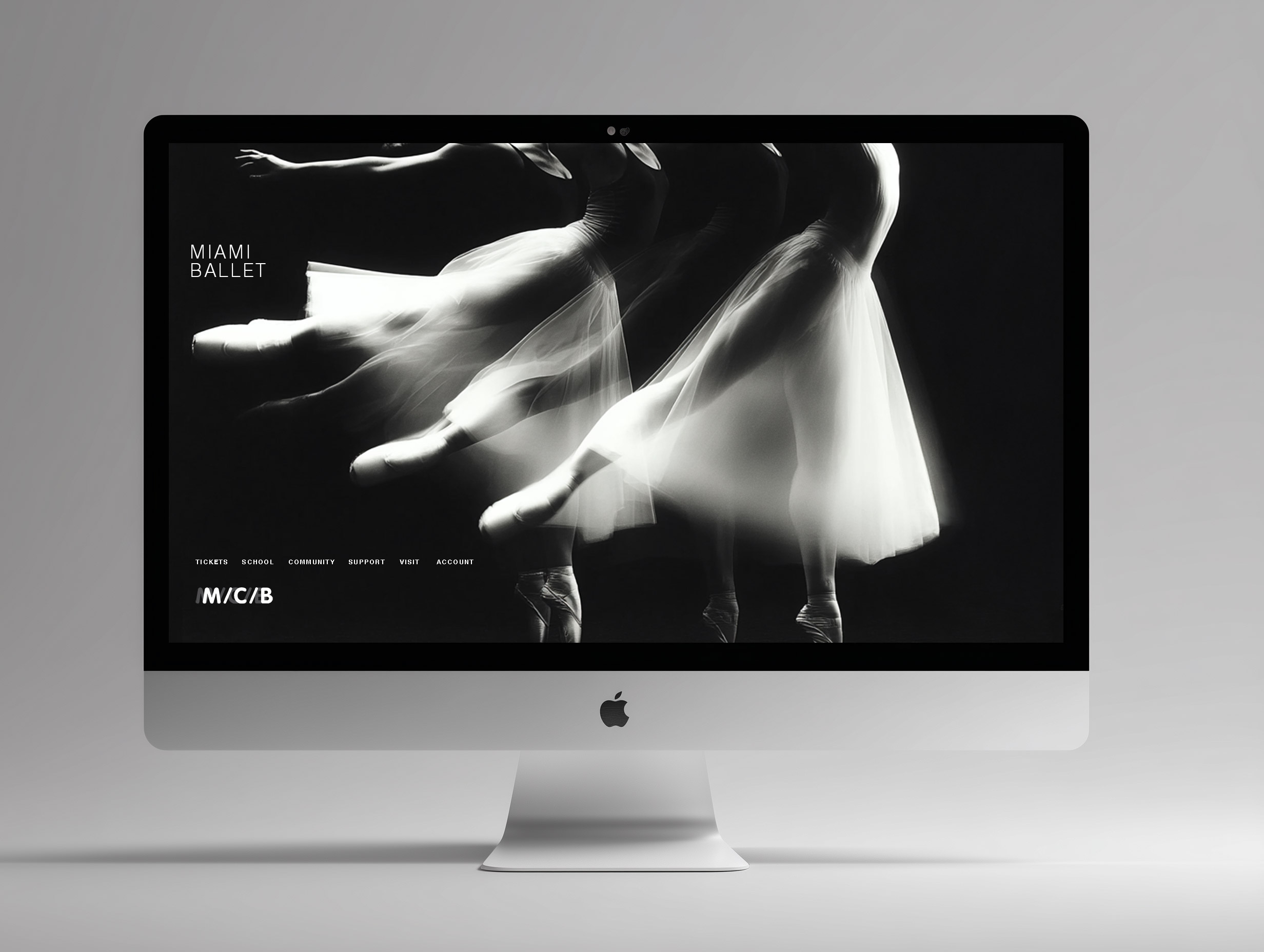
The Website In Time
A ballet website is usually a calendar with ambitions. This one moves. The motion language of the campaign carries into the digital space—traces, transitions, nothing that sits completely still. You navigate it the way you watch a performance. With your eyes slightly ahead of where you are.