The best design does not require your attention. It simply stands there, doing its job, looking good doing it. A sign that tells you where to go while also telling you something about where you are. That tension—function dressed as meaning—is what this issue is about.
We are interested in the city as a living brief. In the typeface that survived three rebrands and still feels right. In the beach that is both an ecosystem and a mood board, quietly running out of time.
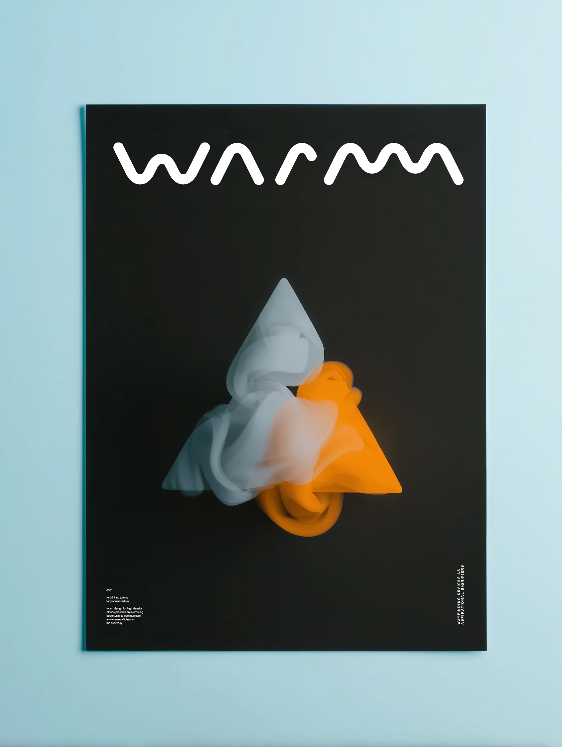


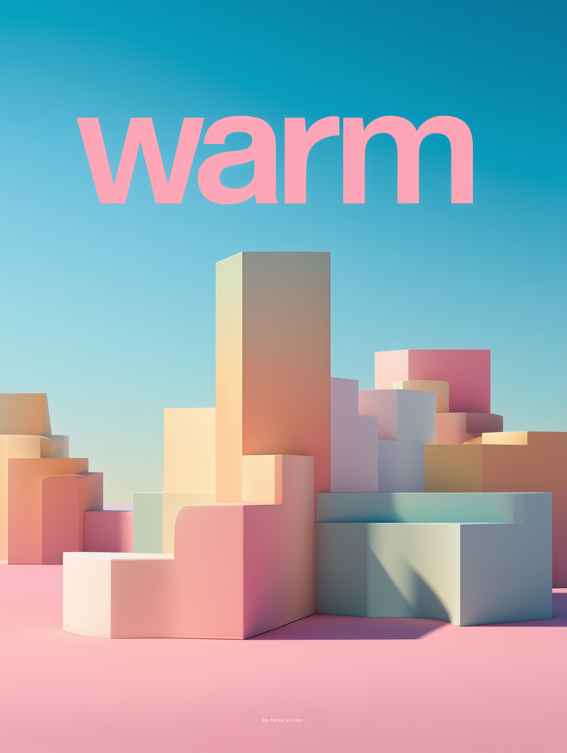
The totem problem
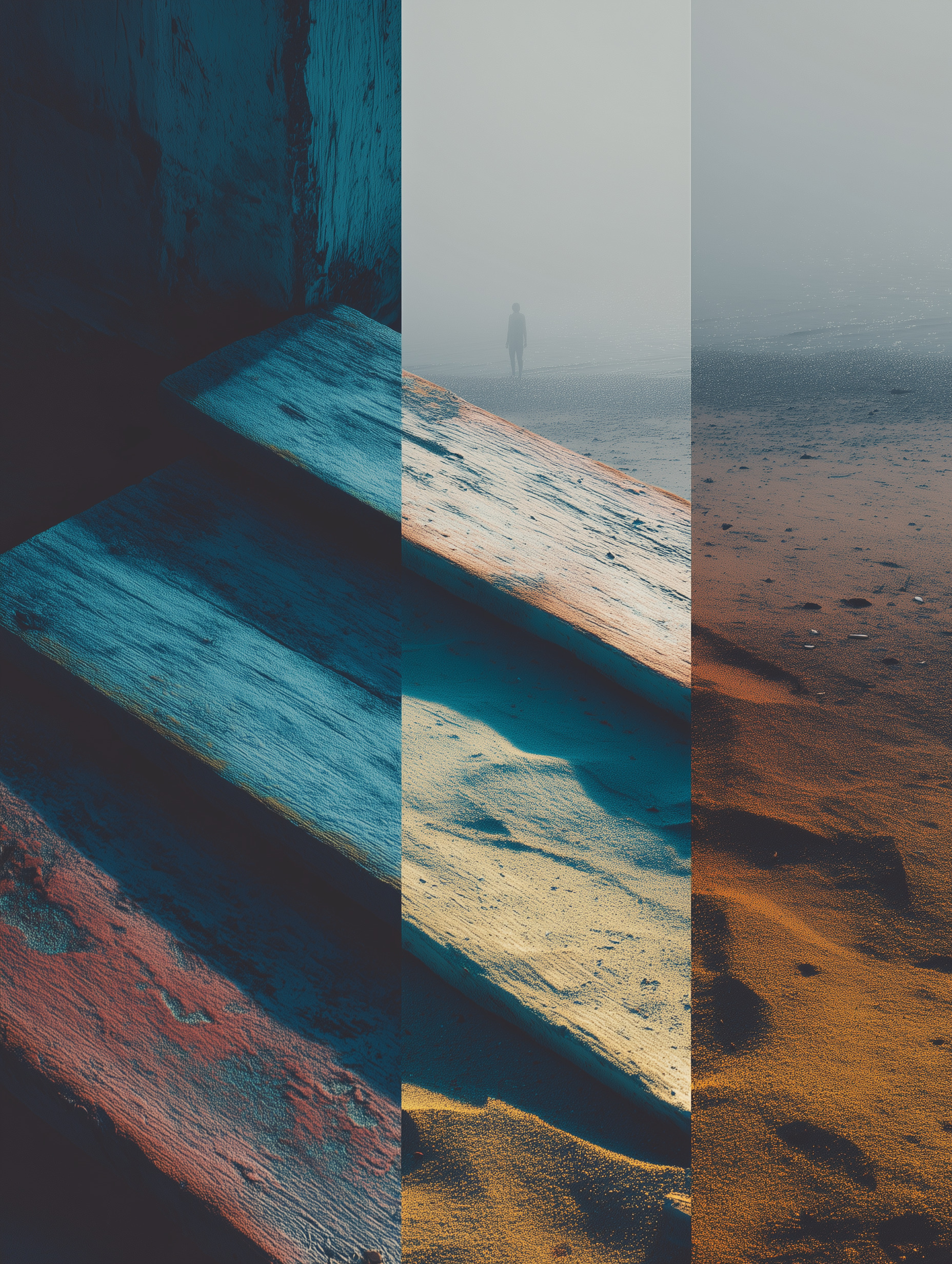
The monument sign exists at the intersection of language and object—it is not quite architecture, not quite communication, something stubbornly in between. Ancient cultures understood this. A totem was never just a marker; it was a compressed cosmology, a vertical argument about who lived here and what they believed. What we erect now in plazas and forecourts, and the soft shoulders of highways carries that lineage whether we intend it to or not. Stone, steel, letters cut clean—the material is making a claim. The question is whether anyone designing them is thinking hard enough about what that claim is.

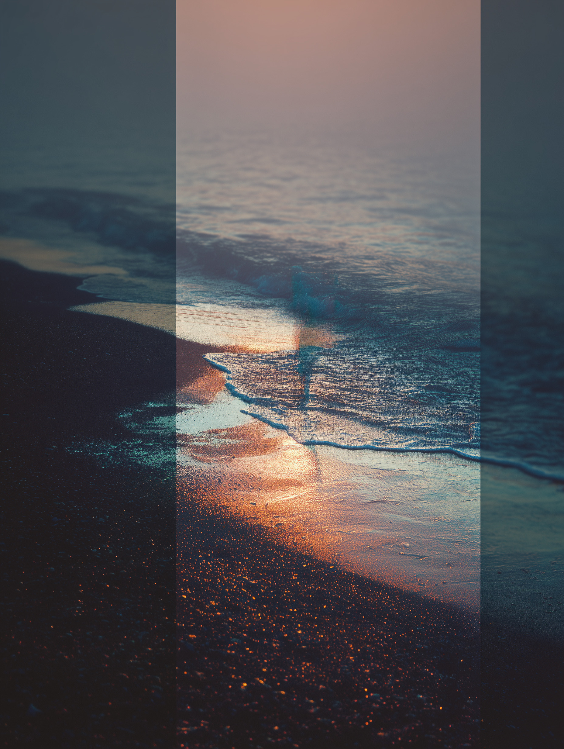
Nature is not an aesthetic
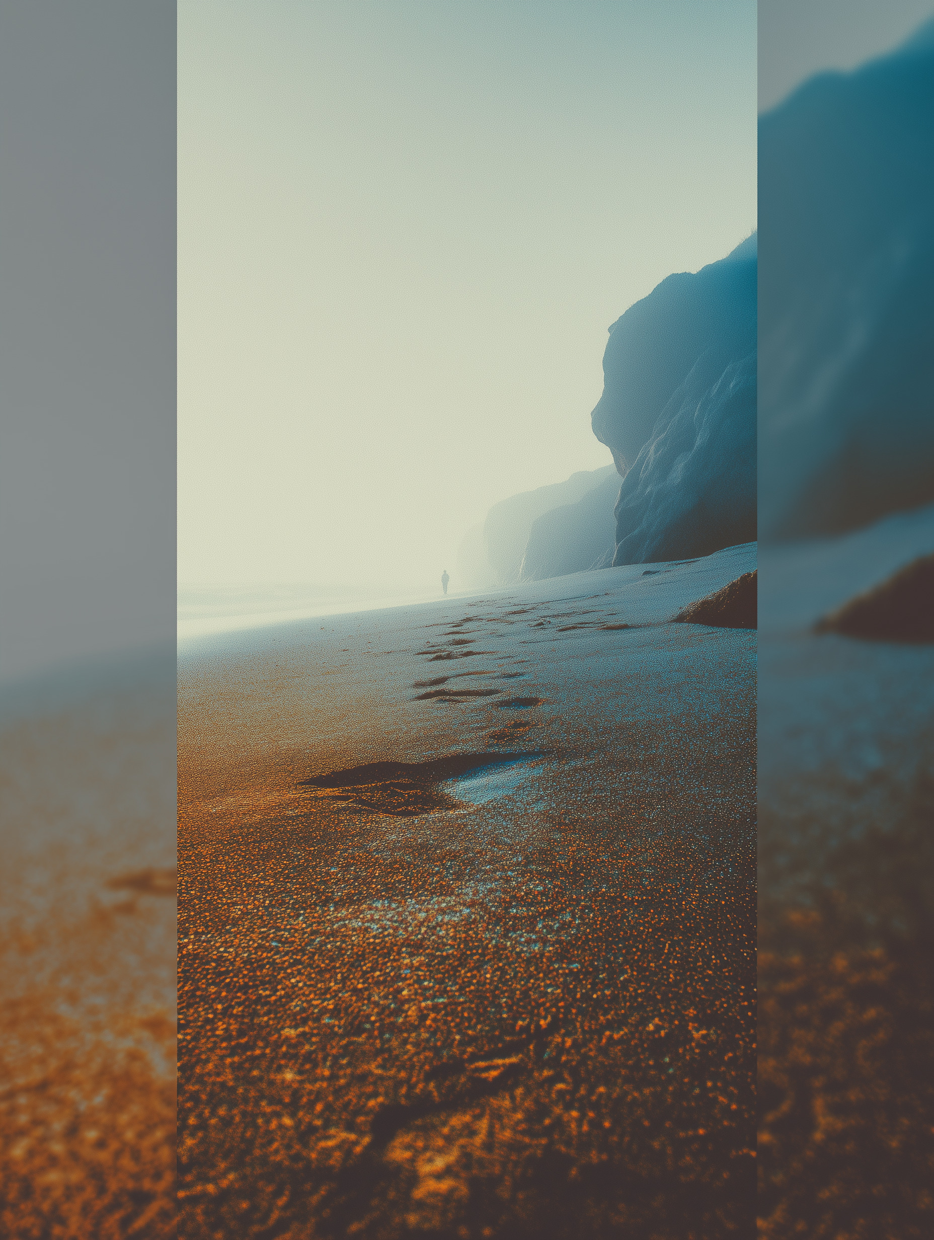
Fashion keeps borrowing from it. Branding keeps referencing it. And yet the actual thing—the reef, the dune, the canopy—keeps disappearing while we render it in pantone. Sustainability is not a colorway. It is an argument, and the deadline is real.
Who is the city for
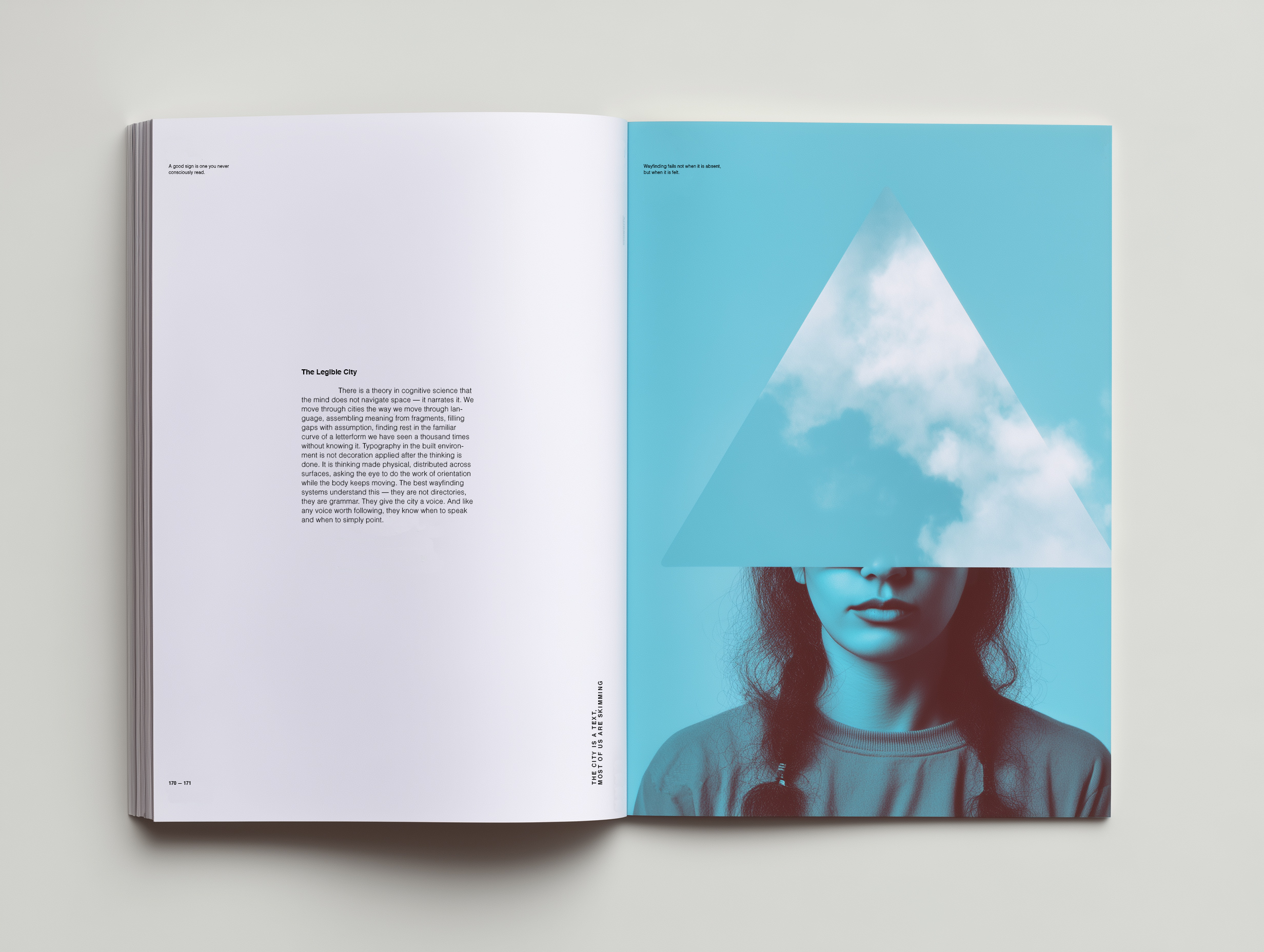
Wayfinding assumes someone is lost. But sometimes the system itself is the confusion—too many fonts, too many arrows, no coherent voice. Typography in public space is a civic act. Treat it like one.